Lumiere 2013
Responsive site for a city-wide light festival around Durham and Derry.
Every other year since 2010, the event company Artichoke have staged a city-wide light festival in various cities around the UK, where local artists and engineers who specialise in light installations exhibit their work.
Working closely with strategists and developers, I led the concept, IA, and look and feel for LUMIERE’s site redesign, where we designed a responsive framework which evolved and changed during three key phases (which we called LUMIERE Live internally).
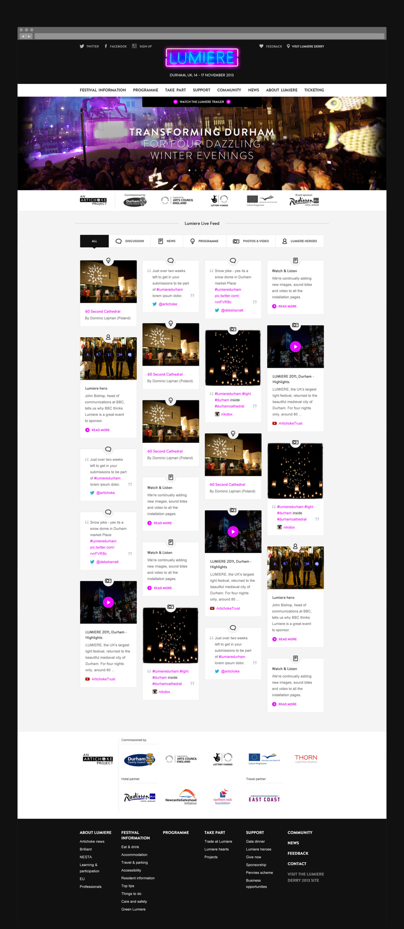
Phase 1: Before the event had begun we designed the site to be very blog centric, where content focussed on installation stories, progress on setting up, and stories from the volunteers.
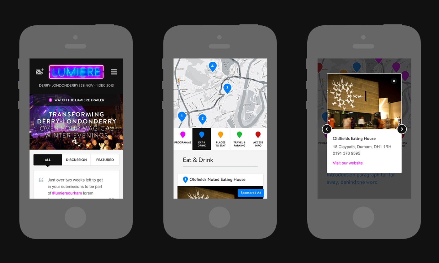
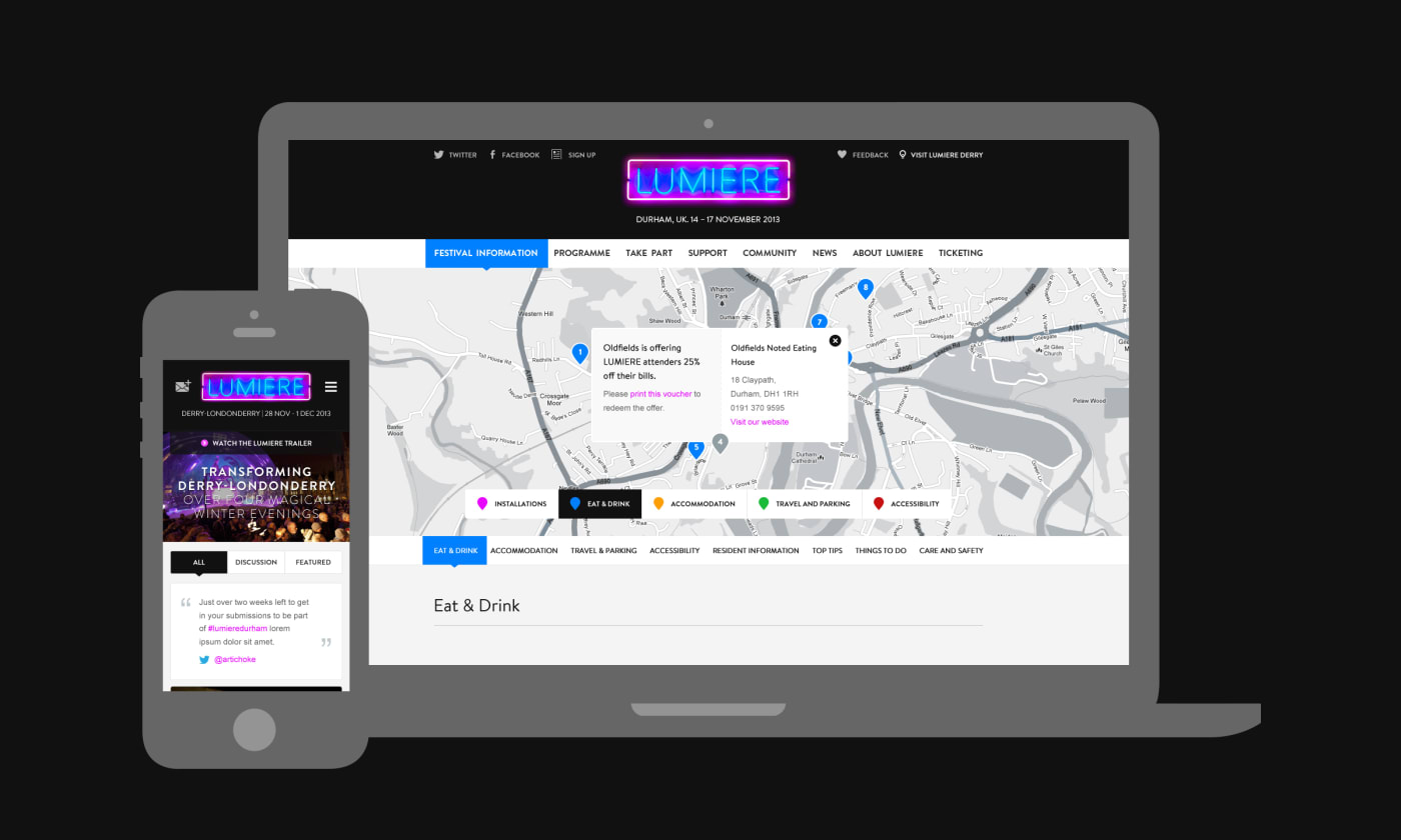
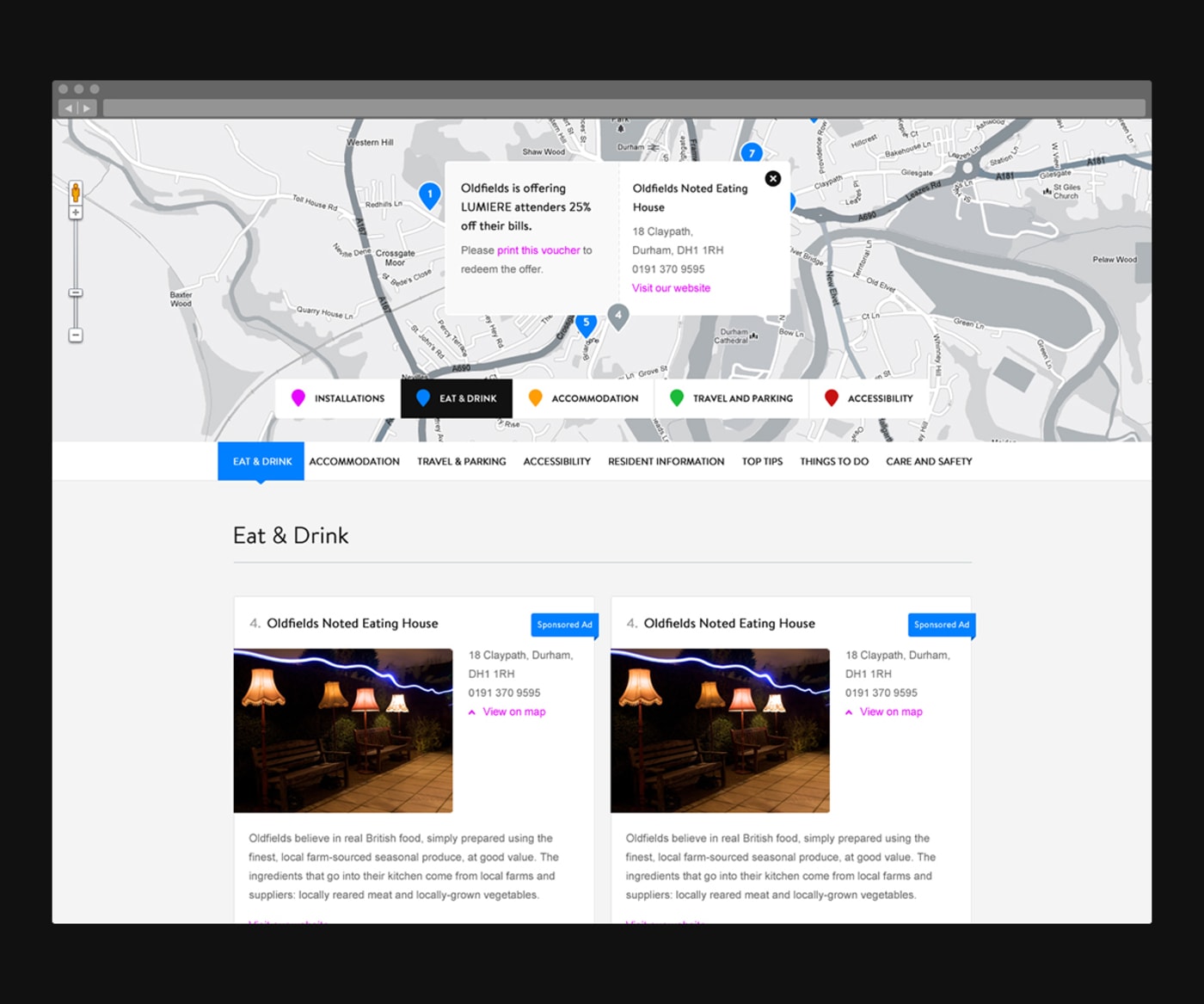
Phase 2: During the event we created a strong focus on maps and directions using Google Maps API, where users could set up the best routes between parking spots or train stations to installations. We also integrated Twitter to create a consolidated space for LUMIERE-based conversation.
Phase 3: After the event had finished we used content from the previous two phases and created an archive. This included conversation highlights from Twitter, blog posts from volunteers about how the event went, and thoughts from the artists and engineers who made it all happen.